10 possibilities for dashboard optimization
The term “dashboard” is used by software providers in an inflationary way, and pictures of it usually appear at the top of the homepages or presentations. They look chic and suggest a sovereignty over the processed information.
But do we manage to use these dashboards in a way that really helps every user – from CEO to customer service employee – in their daily work?
Brent Dykes from Domo has looked into this question and in his article 10, he presents ways to make dashboards more effective.
Here is his article, in the original “10 ways To Make Your Dashboard More Actionable”
Today dashboards are everywhere. They are ubiquitous on our devices, computers and public screens. They help us manage the growing volume of data that we are entrusted with every day. But most dashboards still don’t deliver what we want – actionable insights. While most of us appreciate having more information at our fingertips, we really need insights we can respond to. If dashboards can’t help us improve our performance, it’s questionable how much value they really provide.
Likewise, many dashboards share information that isn’t as useful as it could be. Instead of being provided with actionable insights, we end up ignoring the data contained in these less effective dashboards. Fortunately, with a little more thought and preparation around the design of your dashboards, you can significantly improve their usability by following these 10 guidelines.
1. not an all-in-one dashboard for everyone
Too often dashboards try to serve too wide an audience. But: Different users usually need different information. Whether marketing, sales or customer service employees, whether CMO or SEO marketer – they all have different requirements for a dashboard. A dynamic dashboard should be able to reflect the different roles.
2. involve the end users in the design process
The simplest mistake when designing a dashboard is to assume that you understand the insight needs of end users. To be actionable, a dashboard must include relevant metrics and dimensions that are relevant to your daily work. If a dashboard does not contain the right information or does not deliver it in the right way, it will not be used and will not result in any actions. By discussing user requirements in advance and then getting feedback, your dashboards are more likely to hit the mark.
3. provide appropriate context
Without sufficient contextual information, it can be more difficult to know when action is needed. By adding background information to key metrics such as period comparisons, targets and industry benchmarks, audiences gain a deeper perspective on the results displayed. Urgency to act is introduced when people see that they are underperforming compared to a previous period, an expected goal or an industry average.
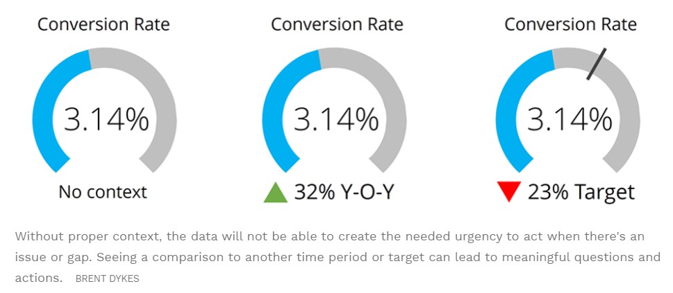
Three readings with increasing context – seeing a comparison with another period or target can lead to meaningful questions and actions.
4. describe how the figures are to be interpreted
As the expertise and data knowledge of end users varies, it is important to explain how the data should be interpreted. If people don’t understand what a metric measures or what it means, your dashboard is less likely to prompt action. Metric definitions and pop-up tooltips can help users better understand the various data elements and charts in your dashboards.
5 Choose the right data charts
Although many charting options are available, you will often find that data tables in dashboards are overused. While data tables can be useful in some situations (granular comparisons), there are often better and more insightful ways to present the numbers. In addition, some charts may be more meaningful than others. For example, it is often easier to make meaningful comparisons with a bar chart than with a pie chart or doughnut chart. The more strenuous it is to see an insight, the more likely it is to be overlooked.
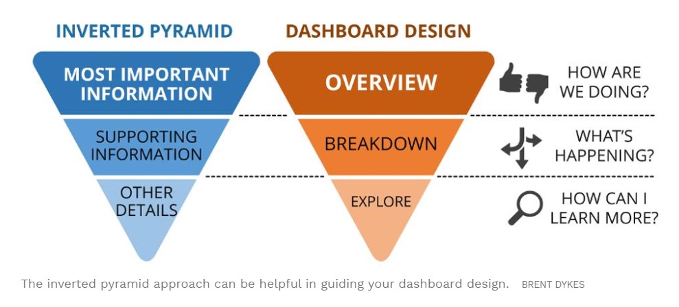
6. anticipate the flow of questions
Dashboards should be designed to follow the natural curiosity and logical questioning of users. A clear visual hierarchy in the dashboard helps the audience navigate through the content. With an inverse pyramid approach, you start with high-level KPIs and then drill down to relevant dimensions. Rather than encountering frustrating dead ends, a clear content hierarchy and filtering options can lead users to insights that require their attention.
7. clear structure for easy use
Displaying too much data can be confusing and overwhelming. Overcrowded, cluttered dashboards can put users off before they even have a chance to explore the data. As UX expert Steve Krug said: “If something takes a lot of time-or looks like it will-it’s less likely to be used. All forms of clutter should be removed so that insights are easier to see and less tedious to find. At the macro level, this may mean reducing the number of charts or focusing on known chart types. At the micro level, this can mean removing chart junk from charts or avoiding excessive granular data.
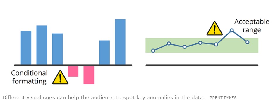
8. emphasize what is important
Most of the information displayed in a dashboard is not noticeable or remarkable. In fact, the unremarkable data can mask unexpected anomalies, trends, or patterns that are important. Using either chart design or technology, potential problems or opportunities can be made visually visible to users. For example, you can use conditional formatting to highlight below-average results or to define an acceptable range for a particular metric. (Note: Warnings should be used to supplement dashboards by notifying people when important variances occur).
9. recommend prescriptive measures
Sometimes an insight into the data is obvious, but the correct procedure is not so clear. Based on predefined business rules, a dashboard can recommend what actions people should take based on a particular insight. If your dashboard does not support automated recommendations, you can use various scenarios, such as significant downward or upward fluctuations in key metrics, to provide guidance on what action to take.
10. review the content regularly
Over time, new content can be added to a dashboard, making it increasingly confusing. Alternatively, a dashboard can be neglected and stagnate, making it less and less relevant over time. In both situations, regular reviews of your dashboards ensure that they remain focused and aligned with your business professionals. For key dashboards, you can review them every six months to ensure they remain focused and relevant.
Conclusion from Brent Dykes:
When you apply these tips to the design of your dashboards, you will see a change in their practicality and effectiveness. From senior management to frontline employees, meaningful dashboards can help you make better decisions at all levels.
Read the Marketoonist’s opinion on dashboards with a wink
Picture source: Pixabay
Note: This is a machine translation. It is neither 100% complete nor 100% correct. We can therefore not guarantee the result.